Displaying text on embedded devices
Contents
There are many ways to display text on an embedded device, but not all of them may fit your HW design. This post will expose most of your options and give you a good intuition about what you need to know in order to create great graphics software. Even if you only do hardware, this will still be of interest to you, since you will get a better understanding of what the architecture of your system needs to be to be able to display text with a certain quality.
Bitmap vs Vector fonts
Bitmap Fonts
This kind of fonts describe their glyphs as a series of pixels with the appropriate color. They are stored as a bitmap on the device’s non-volatile memory and are easy to render on the display, since you only need to transfer the bitmap of a glyph from your non-volatile memory to your display’s framebuffer.
- Pros:
- They are very easy to render.
- They usually don’t require much space on your device.
- Suitable for smaller devices.
- Cons:
- They can’t be easily scaled.
- Enlarging the font leads to aliasing problems (described later).
- Storing multiple copies of the same font for different sizes leads to a serious resource bloating.
If you decide to use bitmap fonts, you will probably need to generate the bitmaps from a TrueType font or some other type of vector font. I recommend using BMFont to convert your vector fonts to a bitmap. In addition to generating the bitmap it generates an XML file that contains the position of each glyph on the bitmap and some additional metadata you may need to render the fonts on the screen for proportional fonts with kerning (variable spacing between two consecutive glyphs).
Vector fonts
These fonts are stored as a vector mathematical description of the font. This means that you need to synthesize the bitmap from this mathematical description before they can be rendered on the display. Nonetheless, you will find that they offer a huge flexibility, since they can be synthesized in any size you want. Typically bitmap fonts will be difficult to scale if it’s not by enlarging their pixels.
- Pros:
- They can be rendered in any size.
- They only have to be stored once.
- Given that they are synthesized on the fly, aliasing is not a problem.
- Cons:
- They are usually large in size (100 kB to several MB).
- They require a library to synthesize the glyphs.
- They are not suitable for small embedded devices.
You should use vector fonts when:
- You have a graphical display with at least 8 bits per pixel. It would be pretty pointless to use such a font for a B/W display which can’t avoid aliasing.
- Plenty of room to store the font in non-volatile memory.
- Software overhead is not a problem in terms of code size and execution time.
- You plan to display text in many sizes using the same font.
- You need pretty fonts for your device.
If you can afford the overhead and software complexity, vector fonts are usually the best choice. However, this overhead is hardly ever negligible and therefore we have to get to a compromise.
If you are looking for a library to render vector fonts, you will probably find FreeType very useful. It is free software released under the GPLv2 license and widely used in many popular platforms.
Proportional vs monospace fonts
If you have ever used an old typewriter or have used a terminal to enter commands on your computer then you have seen monospace fonts. These fonts reserve the same width for each character. Many years ago this used to be the norm. However, as computers started to evolve, proportional fonts became the popular choice. Check the examples below for both kinds of fonts:
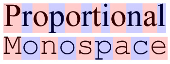
Even though you have a choice here, it is a very easy choice. Given that proportional fonts are very easy to implement from a bitmap, they provide virtually no overhead. In addition to the bitmap, the only thing needed to implement proportional fonts is the metadata of the width of each glyph.
Proportional fonts are usually suited best for displaying text on devices, while monospace fonts are better for computer terminals and some very specific use cases.
Aliasing and Antialiasing
Since pixels on the screen are squared, displaying a glyph using pixels in B/W will result in aliasing. This is the effect by which a diagonal line is represented by small horizontal and vertical lines. For an electronics engineer, aliasing might also be described as the effect by which large frequencies over half of the sampling rate are aliased and then shown as lower frequency components on the digitally sampled signal. For text, the aliasing problem can be best described with a picture:
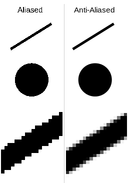
To smooth the edges of a line described by discrete pixels we can apply some low pass filtering to the glyph and get an antialiased version. The question is, how computationally intensive is this task?
If we are using bitmap fonts, we probably want to store the antialiased bitmap directly. This is ok, but you need to be aware of the following:
- To store a simple aliased glyph you just need one bit per pixel. it is either on or off. Storing an antialiased image will probably take at least 8 bits per pixel. You need to watch if this cost is feasible for your device or maybe you need to take this into account when selecting your microcontroller or non-volatile external memory.
- If your display is a black and white display, don’t even bother with antialiasing, after all it will not do any good having a great bitmap if you can’t event display it on the screen.
The other option is to filter the font on the go as you are reading glyphs out. Here you would be trading non-volatile storage (since you can store the aliased version with a 1/8 ratio in size) for computation time. If you have a large ram you may prefer this to reduce your non-volatile storage.
The last consideration is that if you choose to use vector fonts you get antialiasing and proportional fonts with kerning pretty much in the same box, so it is a pretty large overhead.
Final remarks
I hope I have convinced you to think carefully about your project’s requirements when it comes down to presenting text on a screen. There are some critical parts that should not be overlooked when choosing your display and your processors (and this doesn’t even take into account the many other factors of graphics on embedded displays).
These are the main takeaways of this article:
- If you need vector fonts, be careful with your non-volatile storage and RAM. Also, these fonts need to be synthesized and require a library to do so.
- Proportional fonts are pretty cheap, use them whenever possible to enhance your graphics and provide a better UX.
- Even though antialiasing is pretty expensive in terms of non-volatile storage it might still be worth it for better UX for grayscale or color displays. Use it if you can afford it.
- It’s better to plan ahead of future UI changes by having the option to increase your storage, RAM or processing power easily. This means having the option to swap your microcontroller out for a pin-compatible version with more RAM, Flash or processing power. Always design your boards with this in mind and you’ll save time in the long run.
- If you only need one font in a particular size, don’t bother with vector fonts, they are not worth it for the overhead.
Author Javier Alvarez
LastMod 2018-09-02